Mudanza Direct

2020 September - Currently

Main role: UX/UI Designer

www.mudanzadirect.com


Objectives

  • To reach the first page in Google when users type our name
  • Increase the number of calls, e-mails, visits and session duration

Solution

  • Redesing the entire web
  • Create new sections
  • Appeal to a secure transport

Context

  • The client finds himself in a market expasion with a web administrated by him, and wants to launch a marketing campaing with a new web as soon as posible
  • The project was completly remote. I worked with a printing company and a SEO company

My role

  • UX/UI designer, low/high fidelity prototypes, arquitecture information
  • Web designer, administration, web creation
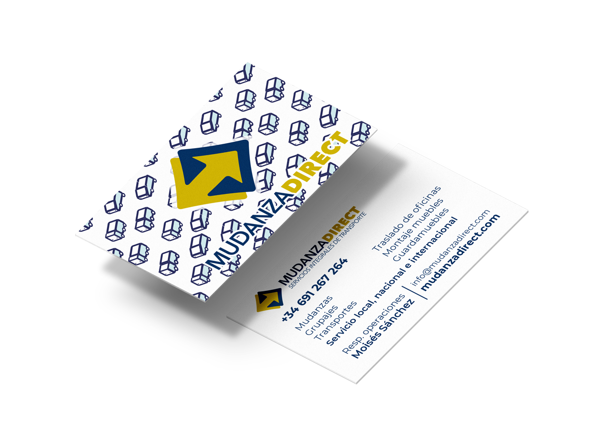
  • Graphic designer, control, production and management of final arts, iconography.

My impact

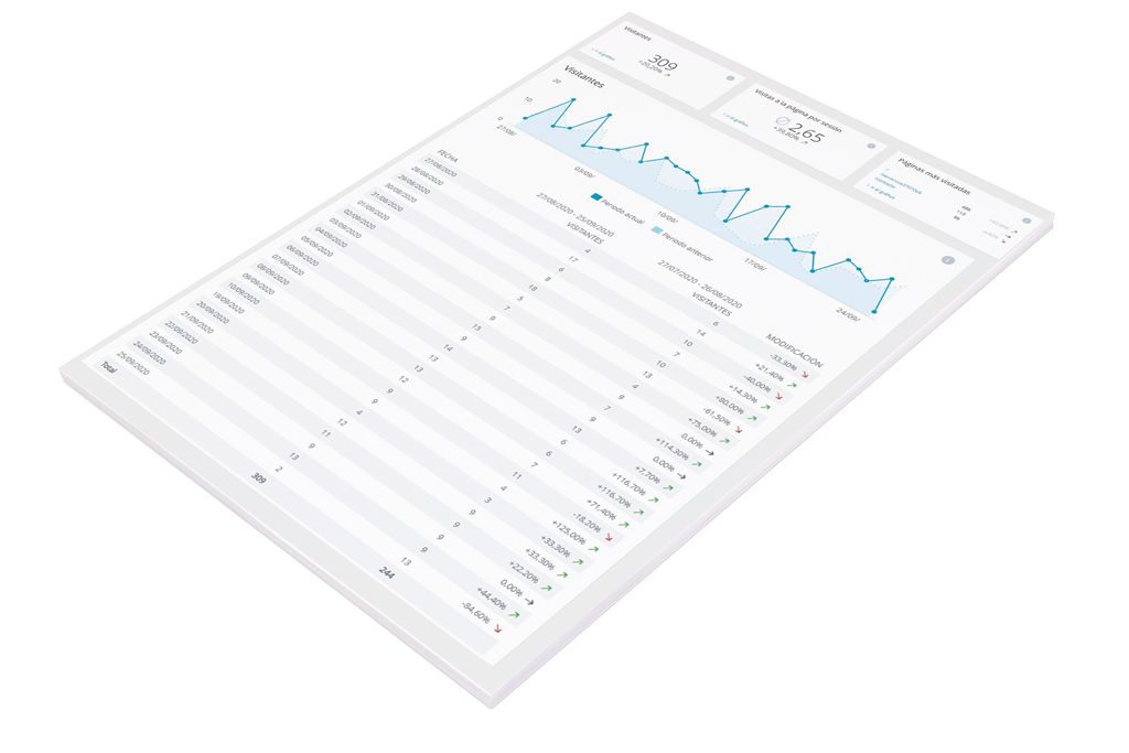
We reached the first page in Google

After deploying the whole new web we reached the 4 page in October, and first page in November, coming from nothing (page 54) this was great.

Visits per page increased in 0.6 points

While COVID it's impacting the data and moving right now it's not a priority for the overall population we managed to increase from average of 2.25 to 2.79 compared to the previous month (september).

Sessions duration increased in 7 points.

From 30,43 to 37,69 compared to the previous month (september).

Research

User research

While I couldn't do a proper research study, I could extract information from my client perspective.

Insights:

  • User feels unsecure and stressed when moving because their goods hold emotional and economic value.
  • Majority of users that contact us are women bewteen 30 to 50 years.
  • Users don't understand that moving from place to another place require more steps than transporting their goods.

Bussiness research

This research was conducted by phone calls with my client and studying the competence .

Insights:

  • Most of moving and transport companies offer a lot of services that can confuse the users.
  • Majority of these kind of companies doesn't have a proper web and rely on comparing tools services or contact indexes in other pages.
  • Small companies as this one relies on comparison-services websites, indexers, or badly designed webs.

Desing decissions

Arquitecture info

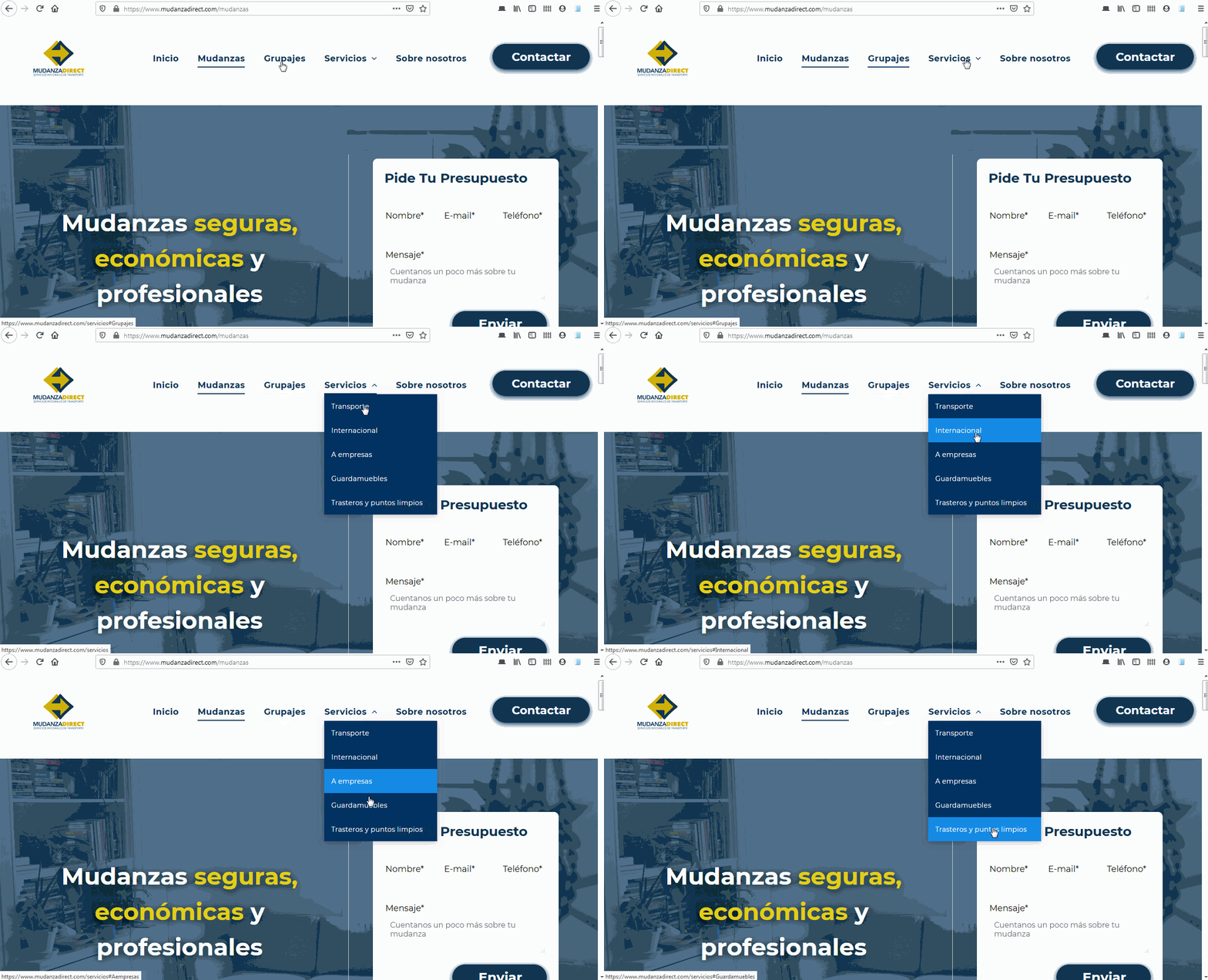
Main income for the company comes from moving services, second one is "grupajes" (a modality of transport), the rest comes from other services. This hierarchy is reflected at the menu level.

Menu provides a clear view of how big the site is and reflects main ways of incomes at the bussiness level. If you are interested in other services you can view them by hovering.

Big font

A better readability

  • As the Majority of our users were between 30 to 50 years old and use the mobile phone to acces the web, we decided to make use of bigger font-sizes.
  • This segment of users commonly struggle with deficiencies at the eye level and have to wear glasses, hence a bigger font-size for a better readabilty

Security & credibility

Adresing the biggest fear

  • We knew the main fear for our users was the lack of security they feel while moving because they don't know where to begin and their goods hold economic and emotional values.
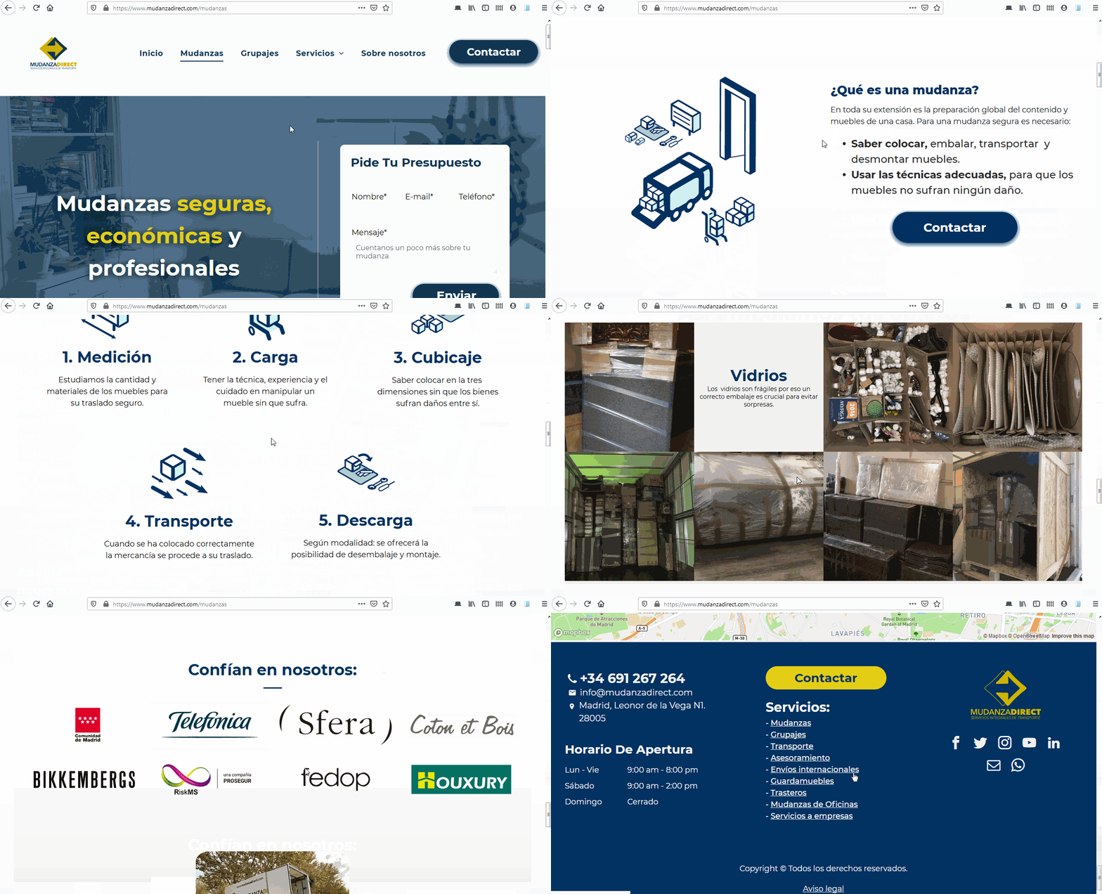
  • For this reason the whole web is directed to give you all the info you need and to show how we are a reputable company that know how to treat your stuff without breaking it. Especially at the moving page were we have a whole dedicated section to show you the proccess and how we package your goods.

A clear footer

Making everything clear

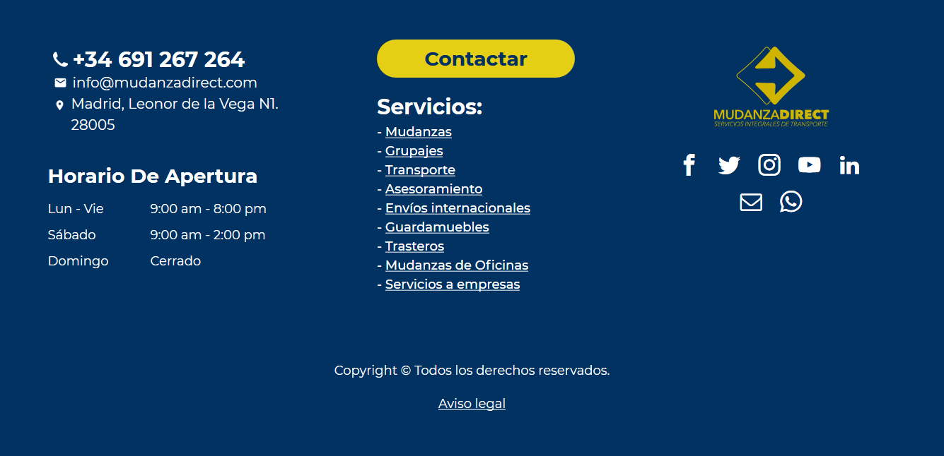
  • While some users can infere how the site is organized only looking to the menu others cannot. Also some users that dont find a concrete service will use the footer as a way to find it.
  • In this section the main objective is to provide a form of contact and a clear sitemap which shows all the posible services which yields more discoverability.

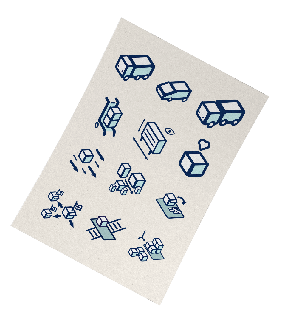
A consistent iconography

A way to diferentiate us...

  • While some resources would be better explained with good photos, this would mean to hire a good photographer something that my client could't afford, hence icons would be the main way to provide concepts, for this reason the iconography plays a big role on how you get the info.
  • It's also a way to diferentiate our company from competence, as not so much companies in this sector have a dedicated package of iconography.

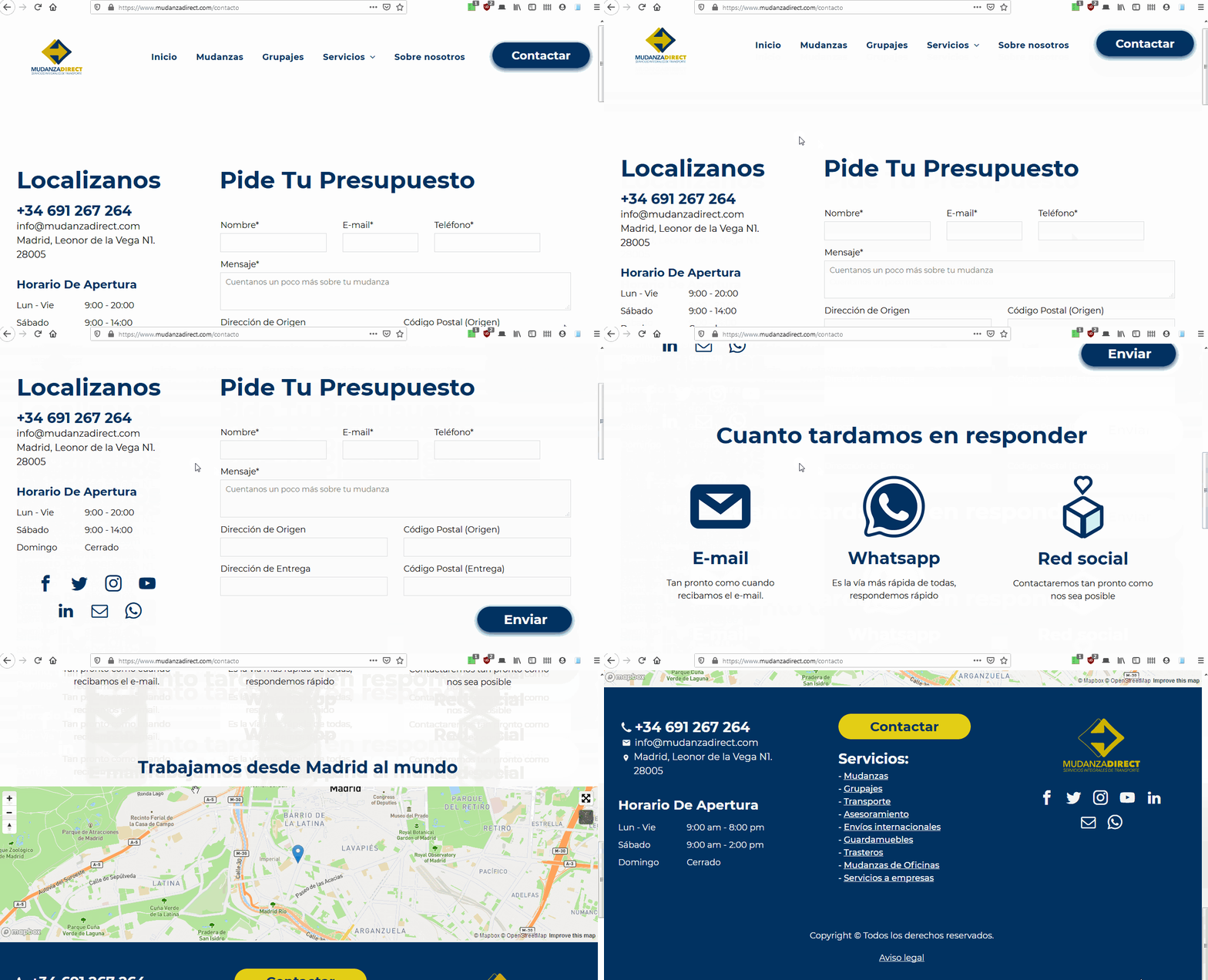
Contact page

Simplicity and knowing when you will be answered

  • The contact page is the bridge between the client and the company, it should reflect both requirements from clients and the company. For this reason this page provides all the ways you can contact the company in a clear way.
  • It has a commonly forgotten and equally important section in other websites, which is when you request are going to be answered and which is the fastest and preferred way to contact us.

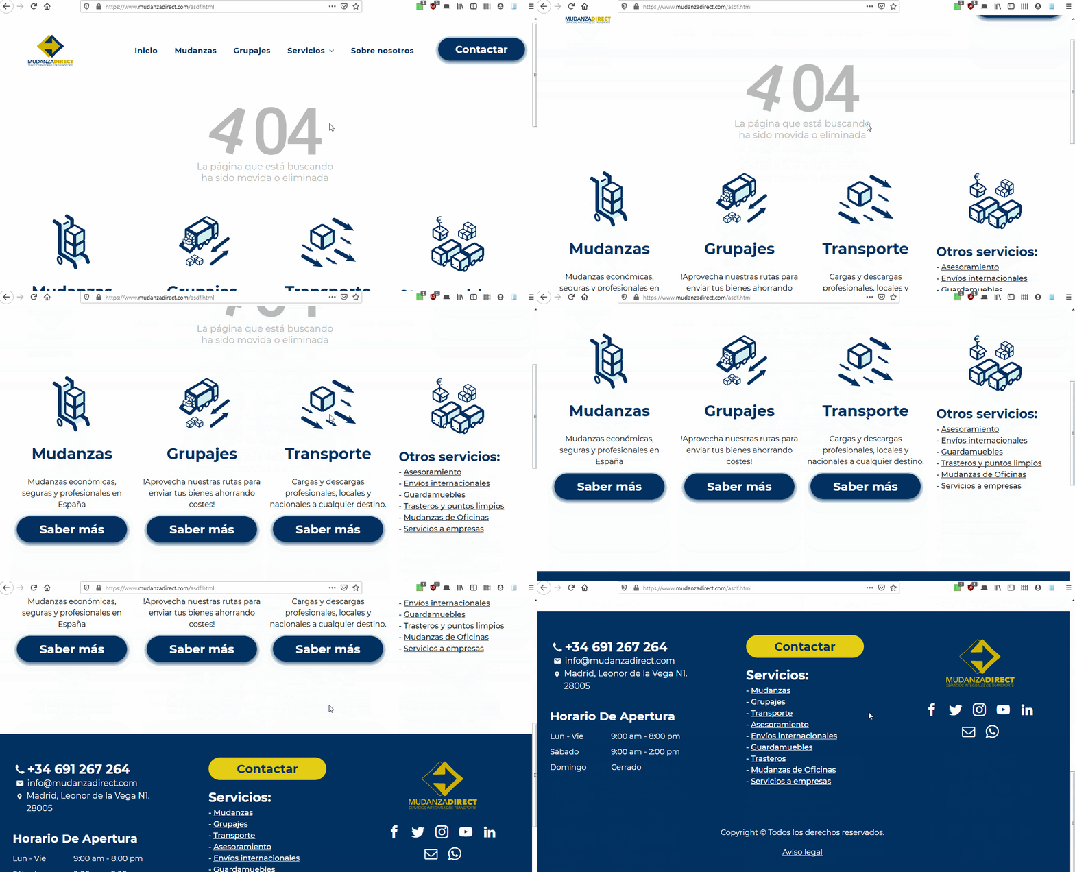
404 Error page

Never been lost again

  • If something can happen it will happen, that means that we must handle server and development errors. And we must provide a solution if we don't want to lose potential customers.
  • The 404 page makes sure you to provide you another services and info if what you were looking for is not availabe. It contains all our services and a explicit sitemap for other services.

Facing problems

  • While the best approach would have been to create the web using wordpress, or even plain HTML serverd through PHP as most of the content is just static, I had to use IONOS site builder (the client had paid for a whole year of this service).
  • This imposed me a constrain that required creativity and coding techniques to bypass some limitations of the website builder.
  • At some point the client hired services from a SEO company, lately he shut off every comercial relationship with them due to they weren't available for him, this made the adsense campaing to stop, dropping the count of users who visit the web.

Conclusions

  • Looking at the stats I realised how much impact does Google AdSense has in incoming traffic to websites
  • First requests from the SEO company were in some way missleading but I managed to understand what they wanted with the help of people from my sector.
  • Most of the time clients don't really know what solutions do they need so to give the best solution you must to understand their problems and translate their intetions.

UX projects

Already viewed

You are here!

Research - Ideate - prototype

ASOS App case study

2017 | 2018 November - May


Objective: Build loyalty among Spanish young.

Solution: Gamification and exclusive services.
Read more

Already viewed

You are here!

Remote work - Web desing - iconography

Mudanza Direct

2020 | September - Currently


Objective: Increase overall experience and metrics.

Solution: Redesing the whole website, new iconography.

Read more

Already viewed

You are here!

Bootstrap - Material Desing - Axure

AREASeys

2019 | September


AREAseys required me to design two screens following Material Desing system and one Html using bootstrap.

Read more

Other projects

Already viewed

You are here!

Visual indentity - Remote - client

Working at F10

2017 July - September


A small new company needed to develop a visual identity.
I worked as freelance.

Read more

Already viewed

You are here!

Big public event at Madrid

La Noche de los Libros

2017 January - April


Big public event at Madrid which takes place each year.
I worked as designer.

Read more

Already viewed

You are here!

What did I do at Magma?

Working at Magma

2016 | 2017 October - June


Magma is a big company (900 employees) from the cultural sector.

Read more