
AREASeys
2019 | September - A week
Main role: UX Designer
Bootstrap / Material Design
Balsamiq / InVision / Axure

2019 | September - A week
Main role: UX Designer
Bootstrap / Material Design
Balsamiq / InVision / Axure
To design:

There were two types of work, the ones that I knew how to do it and the ones I needed to learn how to do it. I knew the most difficult part would be creating the HTML page using bootstrap because I had never used it.
I decided to invest the first days creating the HTML page while learning bootstrap library and the remaining days designing the screens. This way if I had found any difficultly I could always had spent more time finding a solution to it.
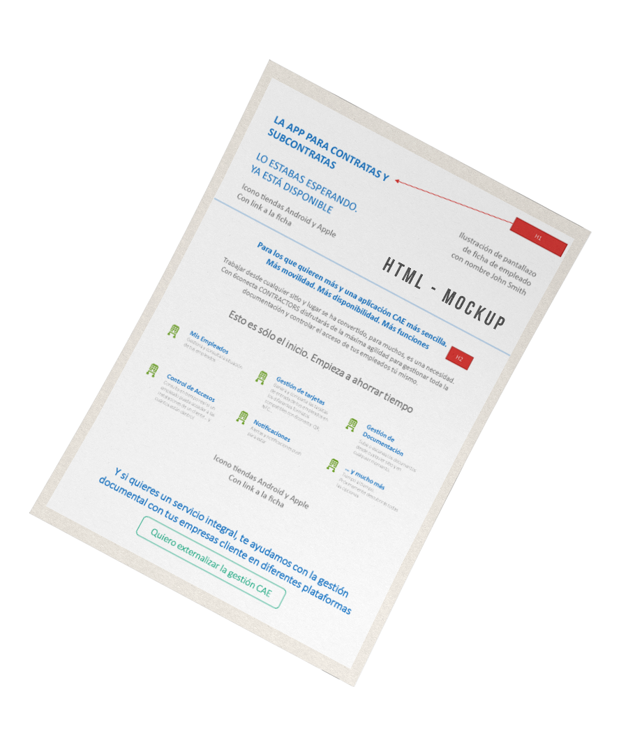
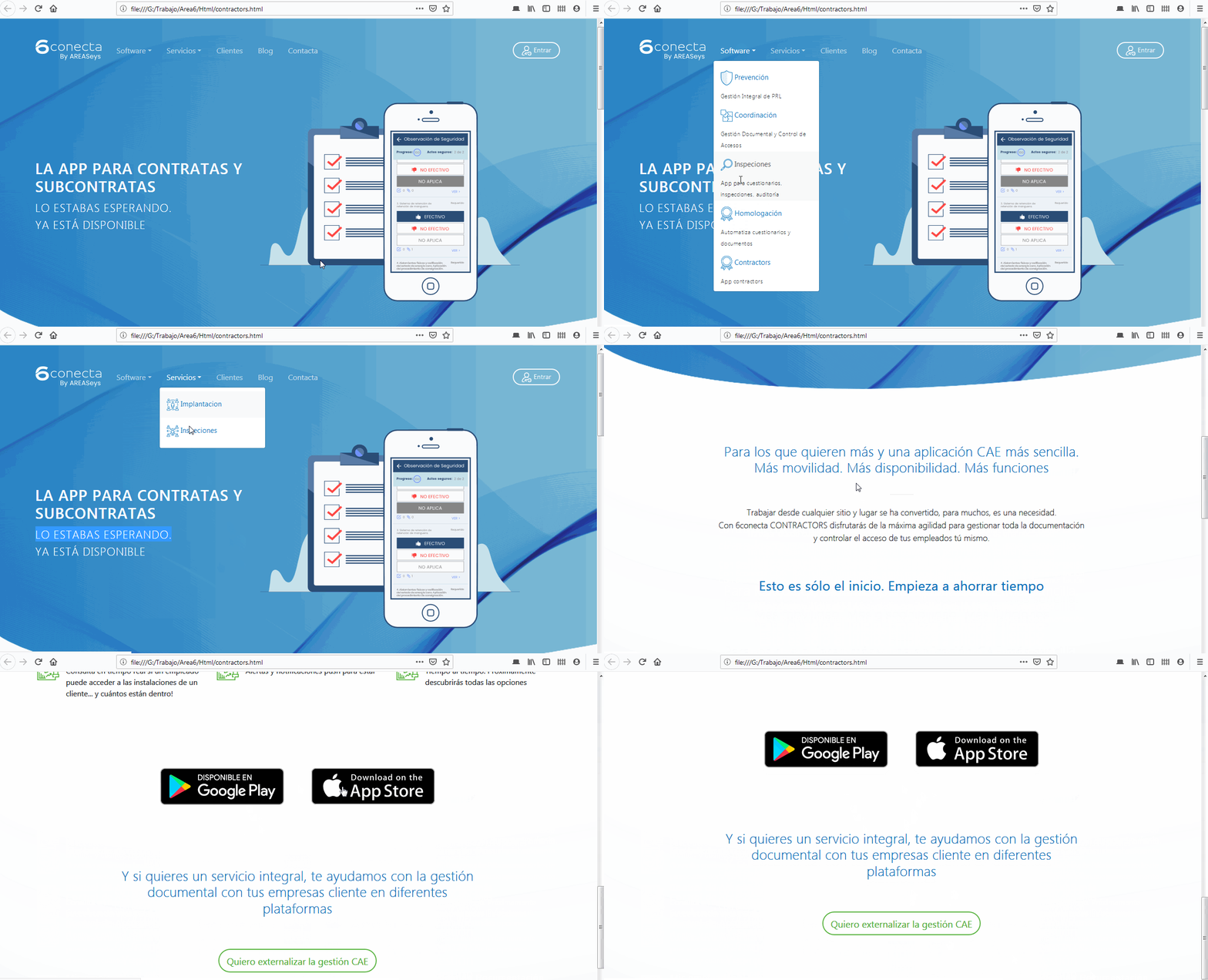
I spent most time fixing small errors, and adapting the CSS to the visual identity they were using, because I had to did it from scratch.
I could have used JavaScript bootstrap API to tweak the menu and give it the final touch, but again time was a handicap and also I considered my work to be enough to prove my capacities.
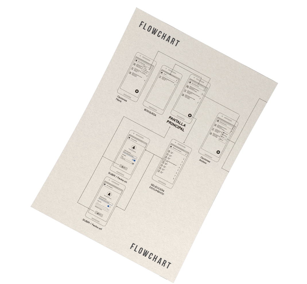
I started directly using Balsamiq for sketching a really fast low prototype and a proof of concept. And since screen 2 required some functionalities to be complented, this means more screens, I created the proper flowchart with the same tool.
I were tempted to use InVision for this project but I needed to find a good library for Material Design 2 if I didn't want to spend time creating one on my own. I couldn't find a good library for InVision and Axure had a very good one made by the community.
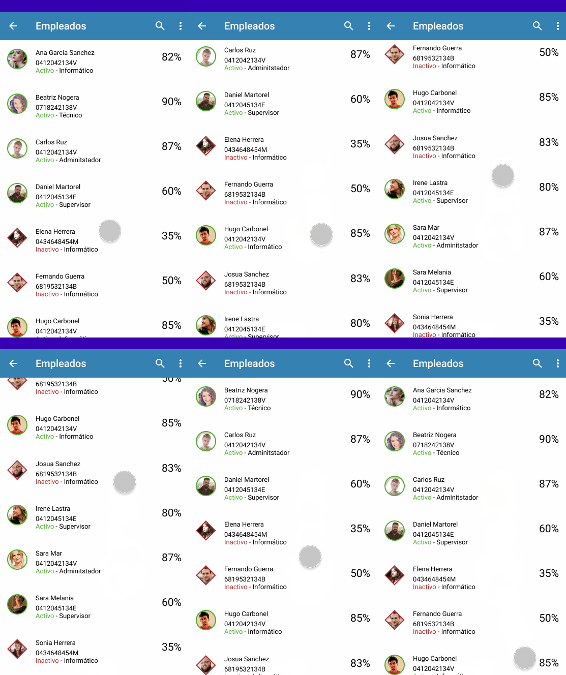
A screen that shows active/inactive employees. It must have: a header, a search box an active-inactive filter. Info to show: photo, complete name, NIF, job and capacitation status.
I considered that the main purpose of this screen was to discern between active-inactive employees. I needed to define it since I couldn't reach the users to understand their needs. The main module is a basic 'Three-line' list component which changes the shape of photo frame according to the active-inactive variable.
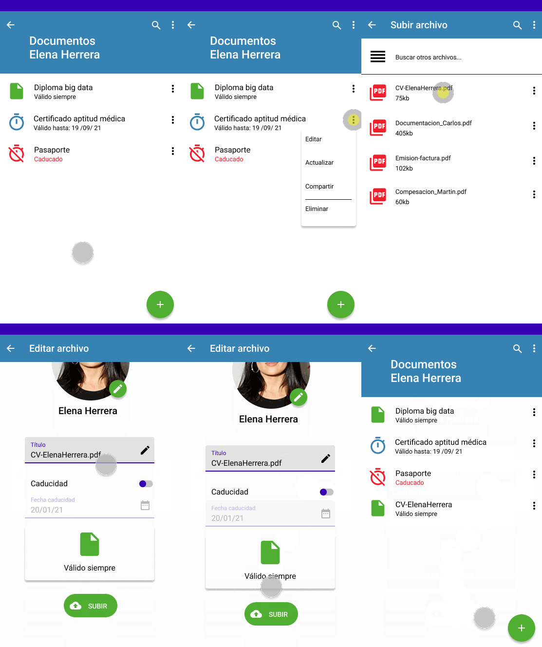
This screen it's used to upload a document for the first time or to update it. It must show: document name, employee name, current state and expiry date.
The main module is a basic 'Two-line' list component which changes the icon according to the expiry date variable. We considere documents which have an expiry date a risk for our users, hence we use the color red as a warning when document has expired.
You are here!
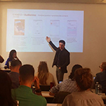
2017 | 2018 November - May
Objective: Build loyalty among Spanish young.
Solution: Gamification and exclusive services.
You are here!
2020 | September - Currently
Objective: Increase overall experience and metrics.
Solution: Redesing the whole website, new iconography.
You are here!

2019 | September
AREAseys required me to design two screens following Material Desing system and one Html using bootstrap.
You are here!
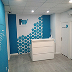
2017 July - September
A small new company needed to develop a visual identity.
I worked as freelance.
You are here!
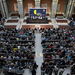
2017 January - April
Big public event at Madrid which takes place each year.
I worked as designer.
You are here!
2016 | 2017 October - June
Magma is a big company (900 employees) from the cultural sector.